In collaboration with Erica Schoeman.
Red is a powerful color; rich in meaning and often full of contradictions. Our initial aversion to the color sparked a deeper investigation into its emotional, cultural, and symbolic significance. This research led to the artistic project Red, in which makers and thinkers respond to the theme not with words, but through visual dialogue.

“Words have a form; they are letters, and you can look up their meanings, but they also have a secret life. They continue to exist even when you don’t use them or when you don’t think about them.”
Maria Barnas
The many meanings of red
The color red carries a rich and diverse range of meanings shaped by various associations. On one hand, there are negative connotations, such as the combination of red and green symbolizing poor taste, or the phrase “being in the red,” which refers to a financial deficit. Additionally, “being red” can also signify membership in progressive political parties.
Culturally, red represents passion, danger, and strong emotion. It plays a significant role in folkloric and political contexts, such as the “Red Army” and the “Red Women” of the labour party. Psychologically, red stimulates the senses and increases heart rate, making it a color associated with sexual arousal and aggression; it also enhances feelings of vitality and health. Interestingly, red is the first color perceived by infants and is used therapeutically to promote healing.
In interior design, red has a warming effect, although it can make a room feel smaller and may be less suitable for relaxation. Conversely, a red bedroom can stimulate sexual activity.
Historically, red has been an important color of expression since prehistoric times, with varied meanings across cultures. In christianity, it symbolizes love and martyrdom; in China, it represents good fortune. In Tibet, red is associated with the sun, while in Africa, it holds spiritual significance in mourning rituals.
In marketing, red is frequently used to convey energy, speed, and excitement, often linked to fast-food chains to suggest quick and hygienic service.
In summary, red is a versatile color with profound psychological, cultural, and commercial implications, remaining a powerful force in communication and expression.
Source: De grammatica van kleur by Marijke van Loon
“Art is not an object, it’s an experience”
Josef Albers
Dialogue: Thinkers and makers
In this project, makers and thinkers explore the layers of the color red through (visual) dialogue. Thinkers are those who reflect on concepts, ideas, and themes. They provide context and inspiration that helps shape creative interpretation. Makers are the ones who turn ideas into visual or material form. Together, they form a collaborative exchange.
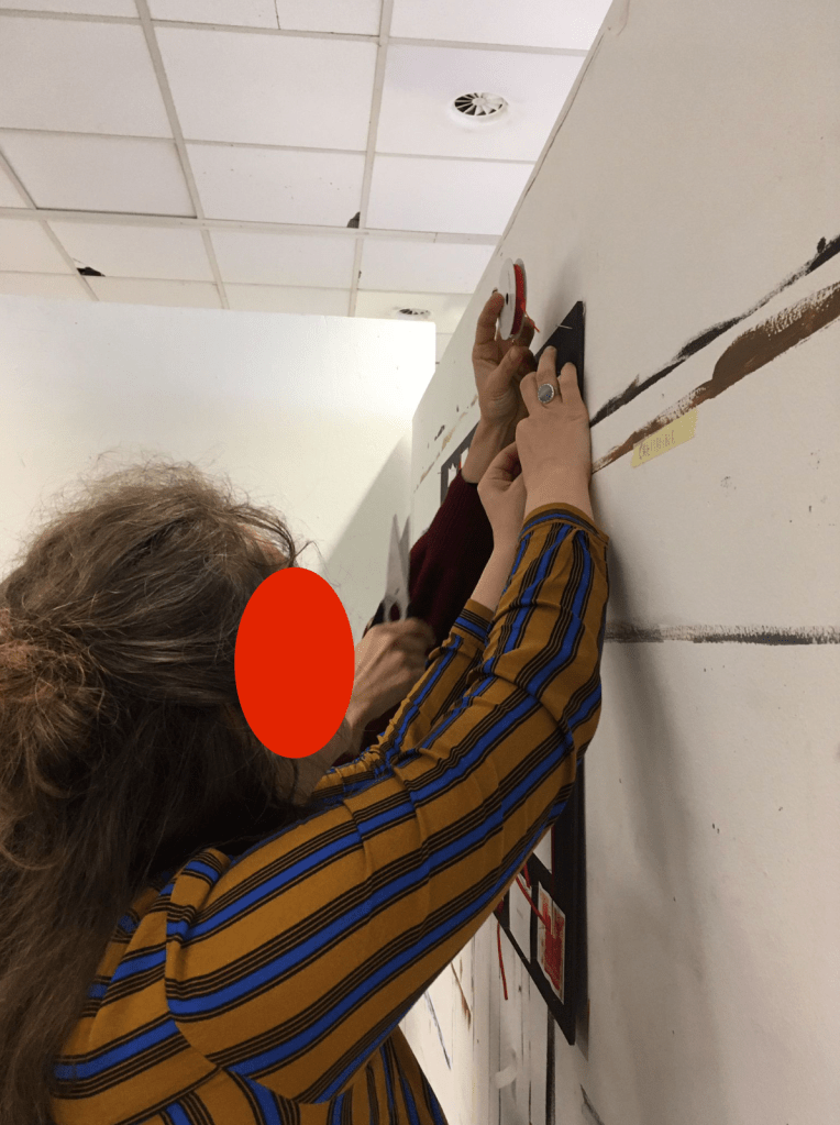
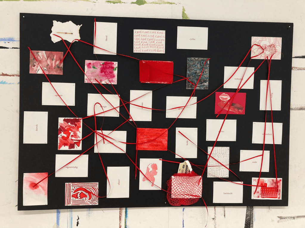
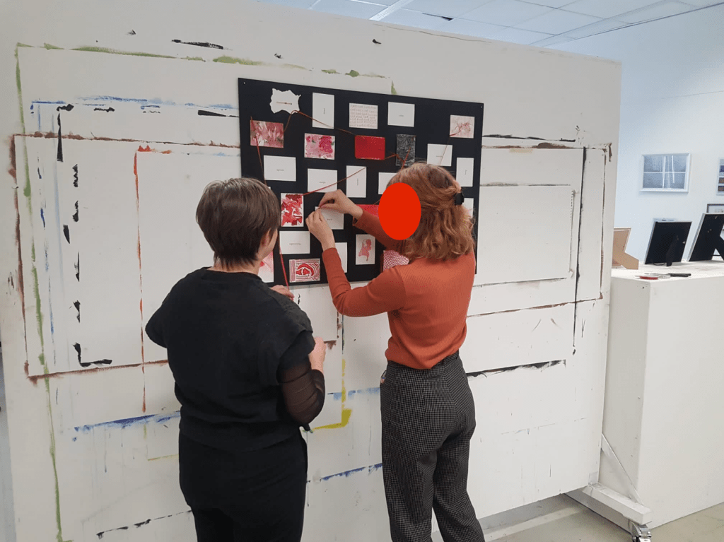
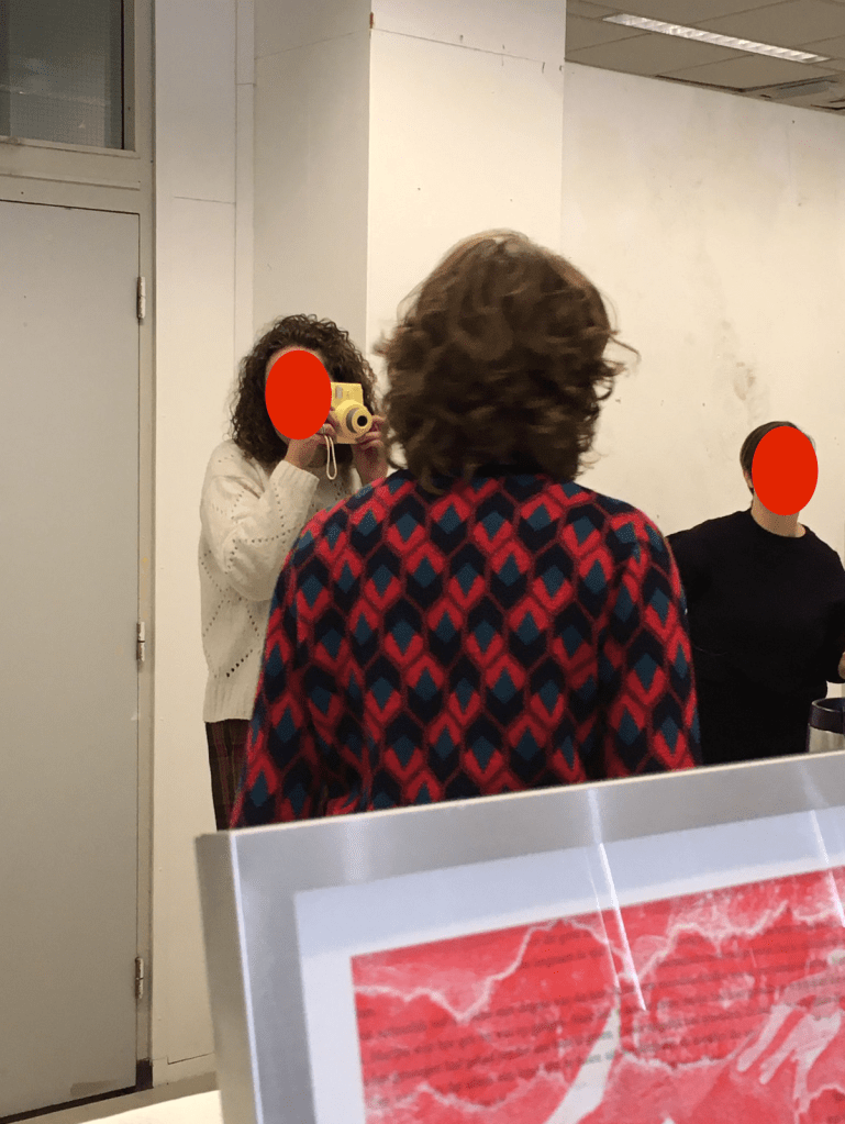
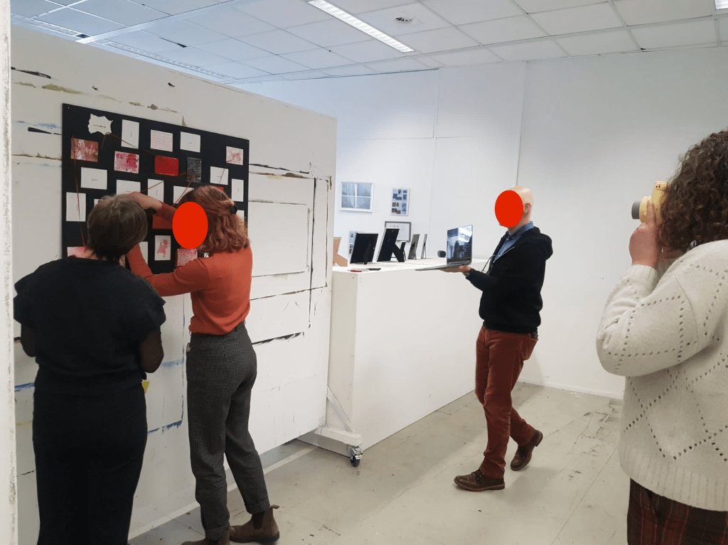
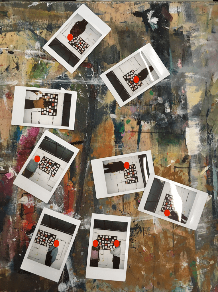
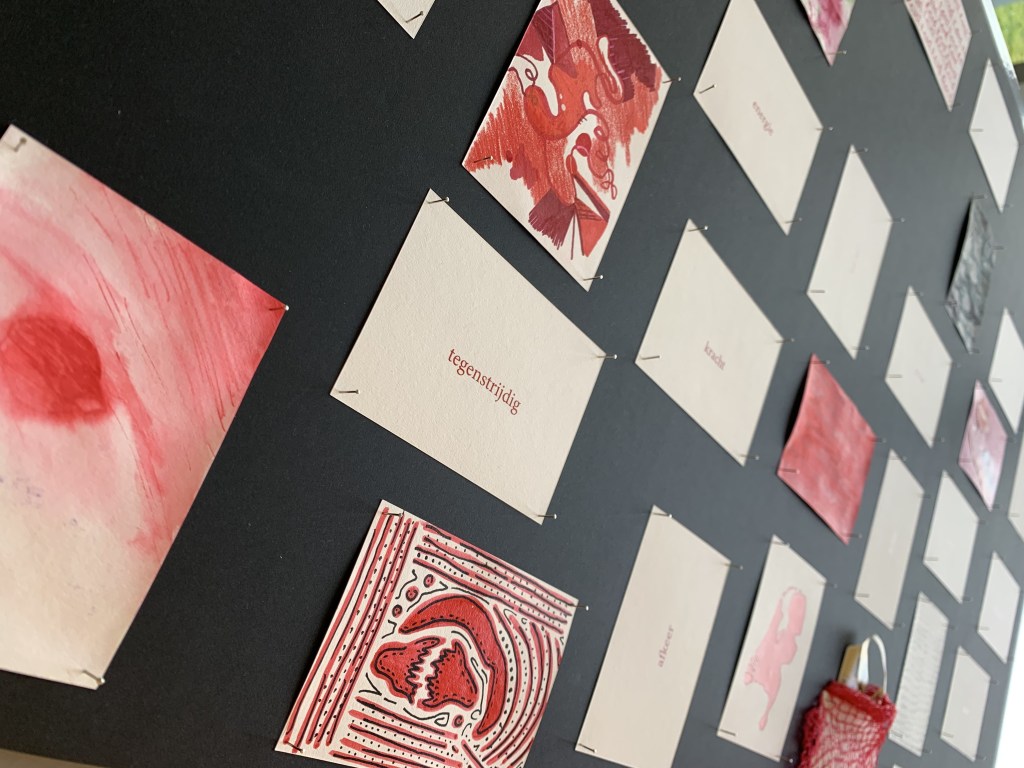
Each maker receives a card with one prompt: red. These visual responses are displayed on a board. Thinkers then add text cards- associations, thoughts, or reflections on the color red. During the presentation, makers use red ribbon to connect their card to another, guided by meaning, contrast, or intuition. A polaroid is taken of each maker with their connection.
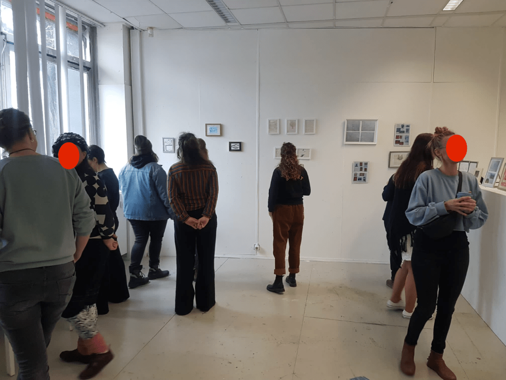
Meanwhile, visitors explore an exhibition of the thinkers’ process, and enjoy red lemonade and strawberries. The event concludes with a group discussion reflecting on the connections made, the role of intuition, and how red was interpreted both visually and conceptually.
After all cards are linked, a discussion follows with questions such as:
What guided you in making the connection?
What do you see?
What stands out to you?
What was your initial thought or feeling about red?
How did you approach your card?
Did it take long to complete?
Does your card align with your initial impression?
What do we aim to convey?
We seek to highlight the distinction between makers and thinkers, while also emphasizing the dynamic interaction between creator and viewer. In this context, Janneke Wesseling’s quote is particularly relevant: the process moves fluidly from maker to observer and back again.
Makers enter into a visual exchange… with the thinkers and with each other. Each creates an individual piece that becomes part of a growing collective installation. After placing their work, the maker adds a new visual gesture (such as a ribbon or placement shift) that subtly changes the whole. At the end, a photo is taken of this evolving composition.
This image is for the maker to keep, reflect on, or share. In doing so, the dialogue around Red extends beyond the project itself. Inviting further reflection, connection, and conversation.
“The artwork is not the final product, a finished outcome of the artist’s thinking in which knowledge is somehow solidified or fixed, ready to be ‘discovered’ by the viewer. Rather, the artwork is an interim station, a temporary pause in an ongoing thought process. (…) The viewer continues the never-ending process of interpretation and the search for meaning that the artist has set in motion.”
Janneke Wesseling
I would appreciate your perspective on this. Please feel free to share your thoughts in the comments section—your feedback is valuable to me.
© [2024] [Lisa Kuiper]. Alle rechten voorbehouden. Mag niet worden gebruikt, aangepast of gekopieerd zonder toestemming.

Plaats een reactie